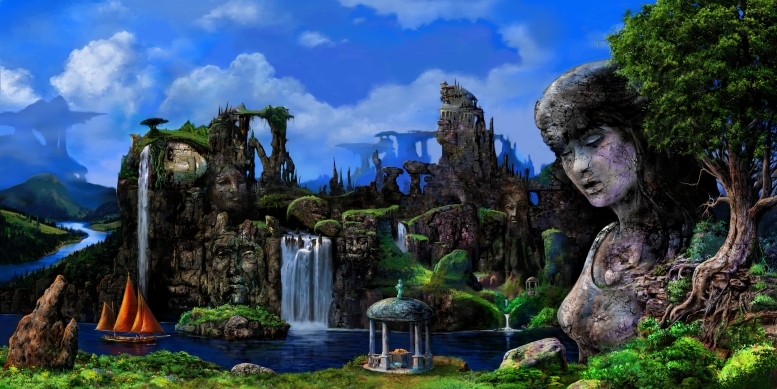
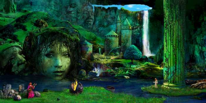
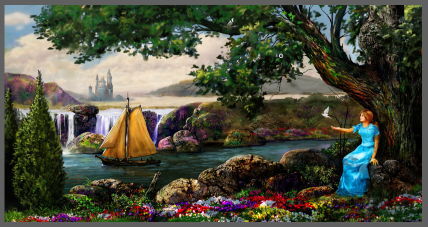
Celebration: This image was an expanded version of a prior- Stone Eye piece. The title is from a `popular' song by Italian prog-legends- PFM. The waterfall was inspired by a Glen Nevis painting, my father created 30 years ago. I wanted it to give it a fantasy feel, but also keeping it Earthly. Although I have been working with a more saturated palette, I resorted back to my tried and true earth-tone hues. In the original sketch, and render, the figure was facing the viewer, but I reversed it to create some mystery.
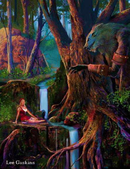
I have been always a fan of fantasy art, as well as fairy tales. In my late teens, I found a comedy cassette that played fractured fairy tales, that was hilarious. Forgot the name of it, but it did influence me to create a bunch of Fairy Tale drawings that are not always child-friendly. I was inspired by Maxfield Parish in this illustration, in particular, the color palette. Little Red Riding Hood, isn't so little (lol), but I gave her enough clothes to not make it too scantily-clad-girlish. The wolf, is more of a large werewolfish monster than the classic fairy tale creature. I rarely have girls helpless or in fear. They are empowered. And she, can take care of herself.
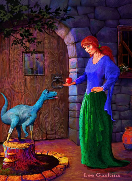
Long ago, I wrote a short short idea, about a woman that helped animals. So why a dinosaur (with a peg leg). I have no idea. I just thought it was cool. This piece took me years on and off to finish. The door was a huge pain. It was this time that I started to play around with brighter colors, and kinda liked it.
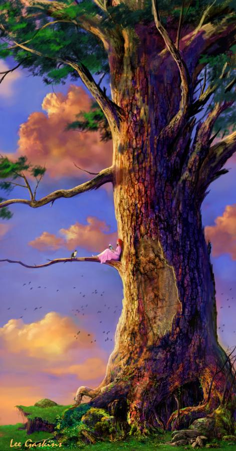
I've done all these long horizontal images, so why not go the other way- vertical. It was a sly image to compose, as it is simply a tree, but in addition, there is a girl reading a book, and a gay and white cat on a limb. This image is a partial idea from my second novel... without the main character in it. The lighting was fun, especially the top half. A fun piece to do, as it didn't have a lot of rocks!
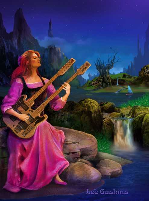
I love double-neck guitars. Whether it was Mike Rutherford, Chris Squire, or whomever, I always liked the look of the instrument. So, as they are (and were), played by mostly men, I painted a woman playing in this fantasy backdrop. I added this image to other works, which you might see if you scroll down. Starting to love phthalo blue. Had to put a limited to background detail, as I wanted her to be the focal point. This image is called Lilith, a partial reference to another Genesis song from 1974's concept masterpiece- The Lamb Lies Down on Broadway.
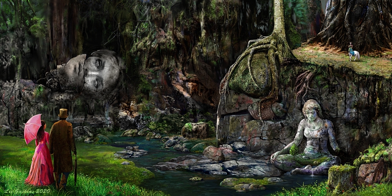
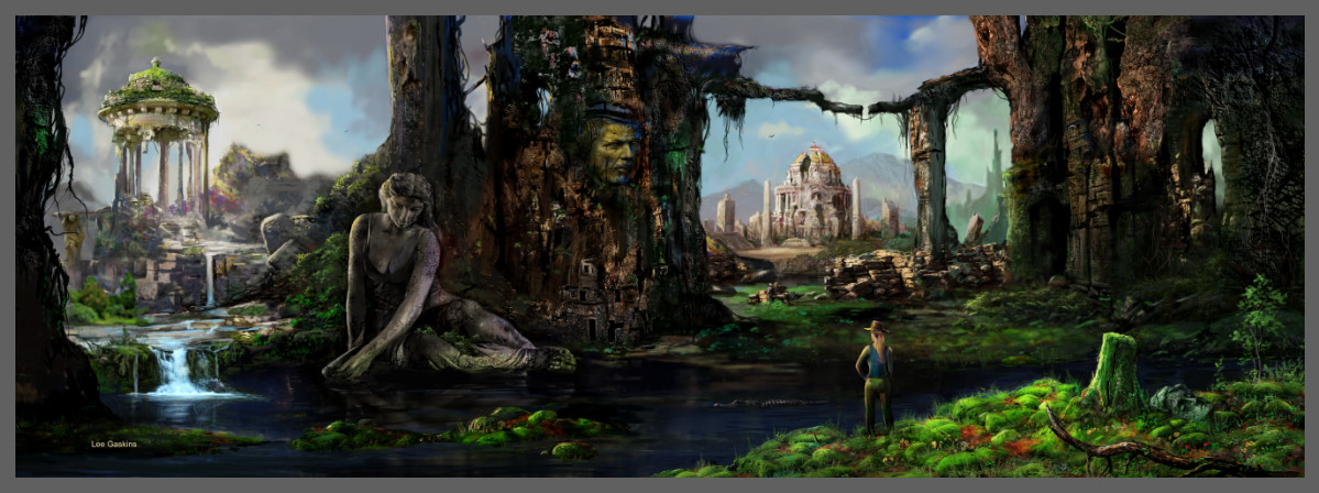
I have had a fatuation for statues and faces in rocks ever since I saw my first Ray Harryhaussen movie as a child. In an era of rubber and paper mache monsters, Harryhaussen created living creatures and worlds, using miniatures, and stop notion animation puppets on shoestring budgets. The background section of this image showcases my fondness for civilizations that embellish art (not war). The boat and the . foreground edifice filled with food showcase a Romanticism, as well as a giving motif to the image. Corny? But intended. The tree almost seems to be like a parrot on one's shoulder. I enjoyed painting the image with a lot of depth. And again, the sideways face, was an album cover by a cheap British musician who begged for album cover art (for free of course)... so after the sob story, I did it, then reused the concept, as a 'seed' to grow around it to form this work . The work went through lots of revisions and changes in sketch, as well as rendering stages.
I used to be obsessed with Lord of the Rings. In fact, as an art student, I could have bought hard written poems by JRR Tolkien for only 250 dollars, in a store in NYC, but I didn't have the money. Ahhhh! Anyhow, the circular door is the nod to the classic fantasy trilogy..... As I stated before, I love adding images from prior works into new pieces. I got this idea from Peter Cross, a fantastic British illustrator who rendered many of the Anthony Phillips covers. Great work! He would hide prior characters, and figures in newer albums. It was fun just trying to see all the secret and in-jokes that he added.
A long time ago, I drew a man with the top of his head cut off.... so I used this idea in the rock head to the right. The girl in- 'Celebration,' is further away in the water, but is facing frontward. I painted the rock mountains kissing, as an homage to my wife. An exercise in texture, and movement.
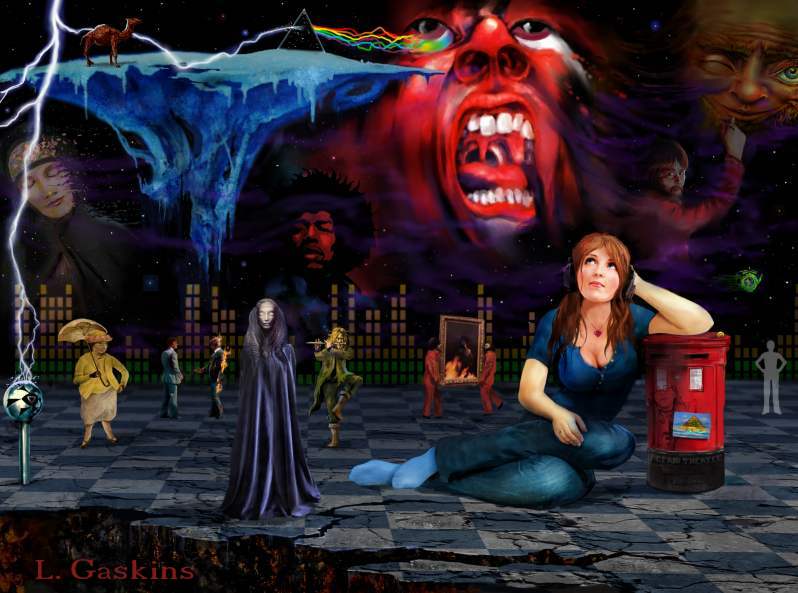
For the people who know me (and that is only one or two), I have loved progressive music since the late 1970s. And even though I listen to a lot of new bands, I still have the nostalgia for the old guard of Prog Rock. I sketched this up during a lunch period in school, and started to go tongue and cheek with the Prog Legend Iconic symbols. I changed every one in some way, except for Mr. Jimi Hendrix. Since Prog music is generally male-dominated, I added a woman.... with many in-jokes, etc. I don't usually like copying others work, but the modification and the fun factor took away some of the guilt. lol.
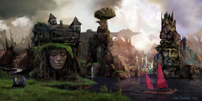
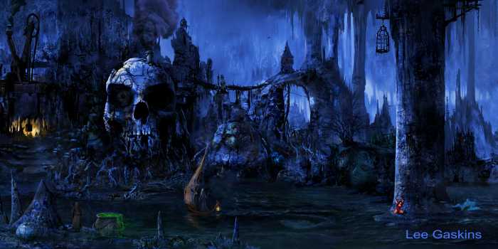
'Househead,' was inspired by The Munsters. lol. Don't know why, but it was. I wanted the image to have a muted palette, and yet be romantic. I do like the idea of contrasts, between the haves, and the have-not's (sound familiar?) The sadness in the rock faces, compared to the wealthy castle in the distance. Because of my mild interest in Zen, I have gained an admiration for balance, and balancing. Having severe tinnitus, I cannot balance myself, but large rocks on top of smaller ones, do make interesting visuals. The cracked sphere in the foreground left represents a seed that has died, the boat. hope. I liked the gray skies and limited color scheme, because it made it easier to enhance the sadness.
As always, this image started from a sketch. The backdrop was inspired by my Dad's image: "In His Hands,' a religious piece. I wanted this to be a small , simple piece that is an exercise texture and rock color. I was going to have the `eye lid' blink and animated the image, but trashed that idea. Again, a spiritual-type of image with no message... just serenity.
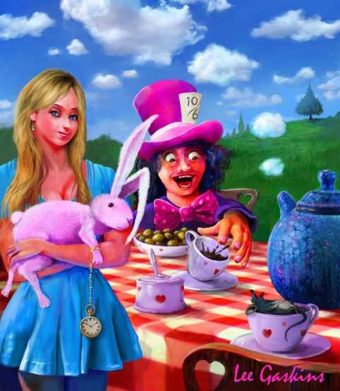
Even though Hollywood continues to mess up Alice in Wonderland stories, the original Disney animated film is still my favorite and the best. Again a fractured fairy tale, I wanted a few surreal elements in the work, so I made Alice carrying a stuffed rabbit, while the door mouse is dead ina tea cup, and the teapot is spouting out puffs that marry into the clouded sky. The checkered table cloth was the most difficult part of the work. Again, I sketched this idea prior to the school day, and made sure Alice had that smirk I was looking for. Later, I came out with the idea of the teapot blending into the background clouds, a slight surreal element.
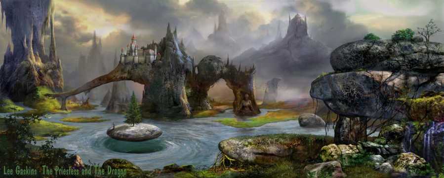
Getting back into the long- horizontal landscape format, this piece- The Priestess and the Dragon, actually does not contain either in the flesh, and yet neither are double images. A lot of people think that the priestess is that small figure on the floating stone, but that is not correct. The whirlpool was very tricky to get right. I hated covering it with the stone, but I wanted another rock-ish element to help the composition. An other exercise in contrasts between texture and mood. At first I didn't like this (upon finishing), but it's starting to grow on me (and little bit). lol
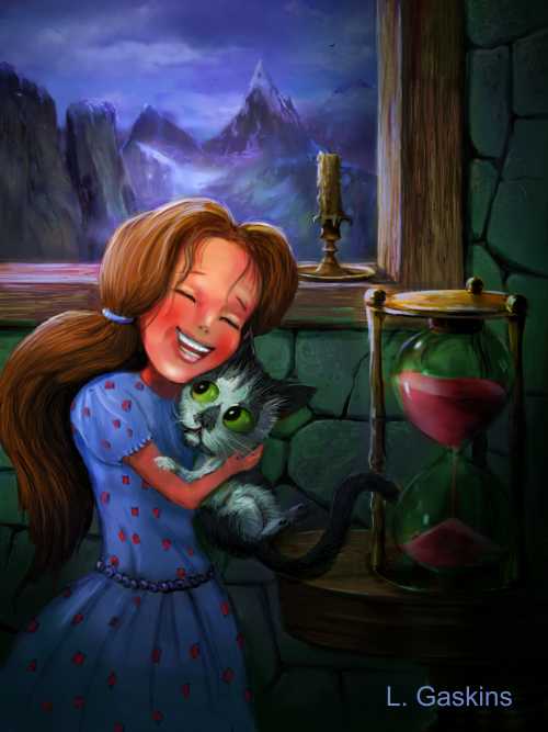
After creating a sexy-ish Dorothy in the Wicked-witch melting piece, I decided to go more children's bookish, but again, with a twist. Ms. Gale is now much younger, and unlike having Toto, as a dog, I have her hugging a cat while locked up in the Wicked Witch's fortress. I painted a cartoon version of my cat Lily, because I simply wanted to (lol). Again, Dorothy is not afraid, empowerment; she'll be alright. The most fun part of this piece, was her dress, the most frustrating: the hourglass. Not wanted to create much mood, the lighting was not important in the piece.
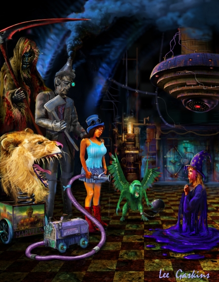
Okay, the 'Wizard of Oz,' is not a fairy tale, but it does have that feel. The classic MGM film is still one of my favorite movies of all time. So it was time to play around with the characters again. Dorothy's a little... um... different, armed with molecular acid, she melt the wicked which (who doesn't see that wicked). Meanwhile, the scarecrow is a persona of Death, the tin woodsman has Frankenstein's monster elements, and the Lion is a weird jack-in-the-box-type thingamajig, lol. I used one-point perspective on the floor, and made sure my composition was strong. Smoke provided atmosphere. The most fun part was the flying monkey who was ball and chained. All in all, it's a very horrific piece, that doesn't seem so horrible.
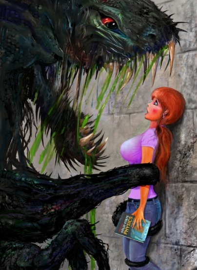
Back to the fractured fairy tales. I am a Disney freak, but decided if I wanted to do a crazy 'Beauty and the Beast' piece, I would stay away from any Disney influence (unlike my Christmas cards). The beast is obviously a hideous monster, but in Belle, although she seems shocked, she is not cowering in fear. I proportioned her pretty outrageously, and also gave her a physics book, because I wanted her to be smart, and not a top-heavy airhead (lol). The trickiest part was actually the wall, to give it depth-of-field. Classic composition, I wanted to make sure eye contact was intense without being too cartoony. Incidentally, I did a blonde, and an African-American version of these pieces as well. This was a blast to do!
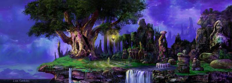
Did I mention that I am a huge fan of Ray Harryhaussen? Well, these two images attempt to showcase this. The left piece, was another- expand a prior-work job. I took the tall tree with the girl/cat on a branch, and 'grew' the rest of the work around it. The Cyclops in the Seventh Voyage of Sinbad, was my favorite Harryhaussen monster.... so I added his head as a statue. The castle on the island was the most enjoyable to do, and adding a beam of light was a compositional element to tie the work together. The 'nude' rock statue bothered me, but putting clothes on it would make it rather silly.
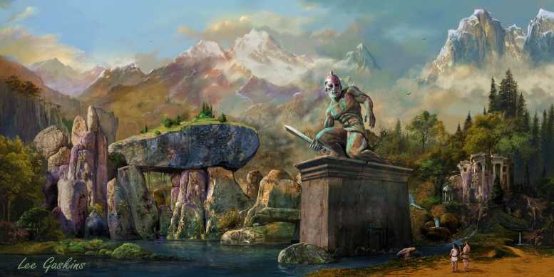
To the right, is more of a illustration from my favorite Harryhaussen film- Jason and the Argonauts. This is probably my least favorite long piece, but it showcases the scale between Hercules, Hylas, and the huge statue of Talos. Of course, the backdrop is not like the movie, but I can state artistic license... can I? The piece is a little right-heavy, but it holds up.
I did mention that I like contrasts. These two works illustrate a story of change: from a hell environment, to one of peace and life (hopefullt what our country will do after D.T. is gone). The hell piece is very complex with figures, boats and even a a Chiron-like ferryman. The girl is tied to the column, writhing in desperation. The skull was so much fun to paint. The right image, isn't an exact modification to the hell-piece, but it parallels it quite snuggly. The skull is now a face with almost a life-like look. The girl is collecting flowers near the column. The beak castle, not a thriving structure. The deedless world, now has a whole to the sky. Light pours in, giving the place life, and serenity. I added the girl guitarist to this piece, and the cracked sphere from Househead, to tie in prior elements, but included fire to the broken sphere. I still think that the hell-piece to the lefty is more successful.
Did I mention that I am a huge fan of Frank Frazetta? No, well it is easily shown in this homage to the late great illustrator. Frazetta was phenomenal- he use no reference! This image was a follow-up to a mock- comic book cover called JEM. It was very difficult to NOT put a tin of detail into the background, but like Frazetta, limited use of environments, I stayed the course. My favorite part is the statue's expression, and pose. One thing I try to tell my students is to not pose everything too stiff (which I can easily do- lol). One of the quicker pieces to paint, although painting wet hair is tricky.
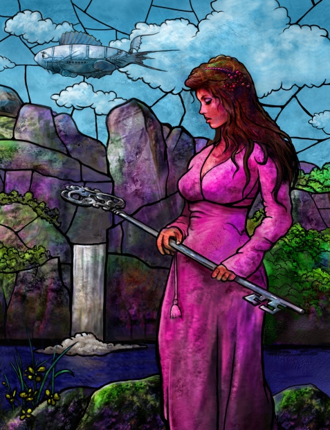
After returning from the Metropolitan Museum of Art with my IB class, and reflecting on Tiffany's amazing stained-glass landscape, I decided to do a small image in that vein. Because of it's simplicity, I think it's one of my better works. The key represents knowledge... the fish-like blimp... because it's cool!
This image took over 150 hours to complete, and I finished during the first month of the Corona Virus pandemic. Wanted to do something serene without going over-the-top. Having it have a Victorian elements was pioneer from the get-go, as I sketched it out in my drawing book... although it began changing drastically, from the initial concept. The statue figure was initially an elder lady with a Asian wicker/stone hat, but it started to look depressing, so I added an element of youth. The rocks were fun to render, too much time adding texture, and cracks, etc. TO help with scale, I added a male centaur in on the above ledge.
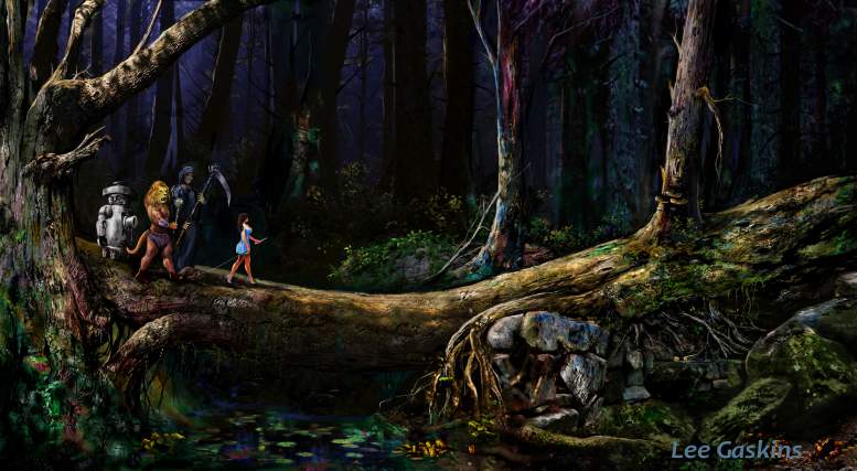
I wanted to do another fractured children's book image, so again, I gravitated to the Wizard of Oz. This time, I went a bit more horrifying (it's tough to see it because of the scale and the way I resized the original (which is massive). Another exercise in texture. Dorothy (not attired in the most conservative of garb), leads her Oz army of powerful weaponry across a fallen tree onto a battle. As always the rocks and trees were fun. I was going to do a close-up of the characters, but I zoomed back to make it more landscape-dominating. Figures moving into the frame to lead the viewer into the composition. This was fun to do and in the original, you can see the checkers on Dorothy's dress.
Going back to a long horizontal format, I decided to go a bit more Zen, which is philosophy I can understand and for the most-part be in-tuned by. A long time ago, I had an Amiga 1000 and deluxe paint III. I created a circular rock with water coming out the center of it. So I revisited this thought, but put the circular formation in the water as well. Long ago, I liked chess, and still like the concept of strategic games, and of course I added a huge tree to balance the figure on the right. Colors are a bit outrageous, but work.
Initially I was thinking Lara Croft, but this isn't her. Started this 15 years ago, after seeing Peter Jackson's Dead Alive (or Brain Dead for some), After seeing the movie Conan the Barbarian, I have been interested in the motion of impalement (NOT in a weird strange way, but the kinetic energy, as well as a way to show someone's sudden and horrific demise. Finally finished it to a semi-liking.
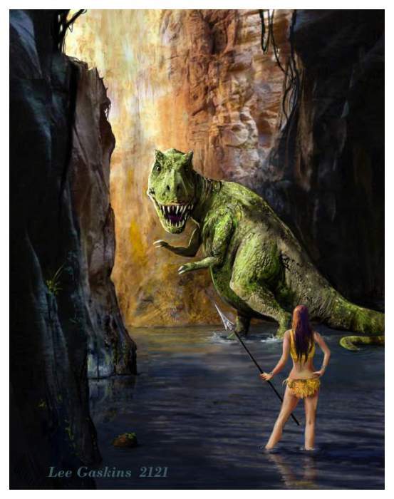
Officially finished this in 2021, but it took me a while, through the 2020 Co-Vid months. I wanted to do another in the 'Hunting Girl' series. I always had a love for Frazetta's work and dinosaurs, so why not combine them? But I veered away from the Frazetta look to keep it more me-ish; in other words, add more and more texture, although I believe I did not go over-crazy with the background. Simple composition, but I took liberties with the lighting (and probably anatomy as well). In a nutshell- it was a fun piece to do.
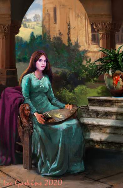
Did this mostly through the 2020 quarantine. I tried to go a bit more classical-looking than normal. Tried to pay a bit with the light and shadows. I was kinda thinking book-cover-like. I enjoyed the cloth, and the color palette scheme. Composition is a bit less portrait-like, but I did not want to center the figure.
This was done partially through quarantine. I wanted to return to a 3 by 1 wide ratio. Entitled: "Indiana Jane,' I was going to ass dinosaurs and such but kept it stark. There is a slight homage to my Dad in this work, and the composition has a different look- a double window effect which is satisfactory.
This was started years back, and I wanted to finish it. Inspired by the movie: 'Date with an Angel' but it seems to have a bit of familiarity to an old Willowglass album cover I created, although this has a bit more fantasy elements, but is still grounded. I rarely do fields of flowers, but I added them. The tree was inspired by an old apple tree at Happel's Farm in Pittstown.
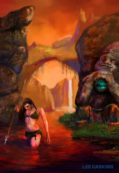
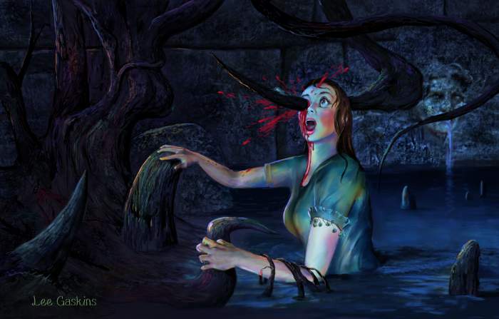
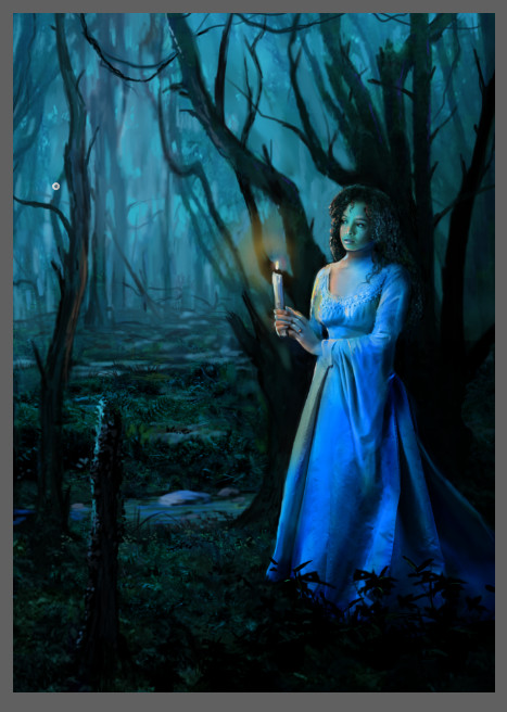
Another piece partially done through quarantine. I'm enjoying working on personal and private pieces, and enjoy the freedom. This could easily be a book cover. I wasn't to emphasis mood over creepiness, but you know, she shouldn't be out there in the mire. What is she doing and why? The woman's name is Claryssa, honoring one of the finest art students I had in school. It doesn't look like her, just vaguely represents her. I later painted this in acrylic with a few changes.
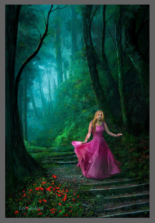
A companion piece to the one on the left. I was initially going for a Disney Princess look, and I still have the vibe, but it's less Disneyesque. I rarely lead the character off the screen's edge (it's the cameraman compositional background I learned in college- lead the movement), but I wanted to make it look like she was moving on.
This image was created for a more darker thought. I began with a young musician who wanted me to do some album art for him after seeing my gallery exhibition at the library. . I gave him a very low cost (as I like to give huge breaks to new artists). The guy never had the decency to even reply. Ah... the rudeness and uncaring nature of the young. So I took his thoughts or a surreal carnival, and used it as a start, and landscaped and darkened it up. Changed the aspic ratio to a portrait. Added a clown cave, a zombie girl vendor and her cart. Very fun to do. And who doesn't like a good McMaggot? So at the end, there was zero of the ex-client's ideas in this. The tongue pathway was fun to subtly add.
Another piece sketched during quarantine then, I painted it the final year as a teacher during lunch and EMAP sessions. My last year was a very tumultuous year, having to do with health issues, a new non communicative and self-centered principal that had no use for the arts and my IB students working very slow. Luckily, the entire IB class passed (yeah!!!!), and I got through the dumbest potty patrol duty that was slapped on me. If it wasn't for Mr. Caputo making me laugh, I would have never made it through.
Anyway, this image is a partial take on a Piers Anthony book, from an earlier sketch did decades ago and later modified. The book stacks were not fun to do. The acrylics were pint-sized old paint bottles, but I had fun adding a few silly details like the cat, and fish grill.