These are quite a few of the X-mas cards I have done. They start out more simple (simpler times), and get more complex and more time-consuming as I `progressed.' Some took well over 140 hours to make. All for the sake of tradition. Please scroll down to see more `sophisticated cards.'
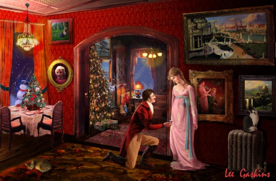
2011 card. This is one of my favorite cards, as I really slathered on the Romanticism. In the beginning, I had `the couple's' journey from friends, to engagement (this piece), to marriage, but then ended the theme. This was the first holiday without my Mom, so I added a portrait to the left of the archway. The window, and snowman were recycled from prior cards, as were a few paintings. To the right of the girl, is one of my oldest X-mas cards, framed on the wall. The top-right image is a huge 1904 World's Fair piece, I painted that in our dining room.
This card is actually inspired by Mary-Ann from Gilligan's Island. She is the small red figurine on the table. Not a very creative card, as I was lacking a cool idea this year, so I went with sweetness, and mood. Although we never had Ginger alive with Lily & Tabby, I put all of them in. The leftmost picture on the wall was one of my first X-mas card I did. This was 2009's card.
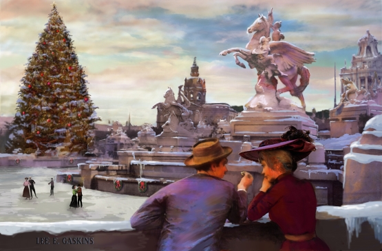
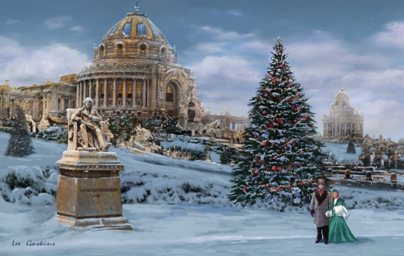
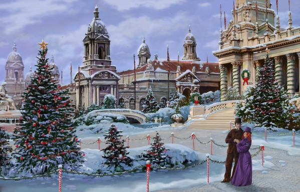
For a while, I used to switch between Victorian , and World's Fair-themed cards. This image included- 'the couple,' watching skaters at the 1904 World's Fair (which would not have been possible). The tree is massive and took a long time to paint. And as always, snow is a lot of fun to render. This was 2010's card.
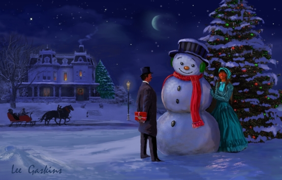
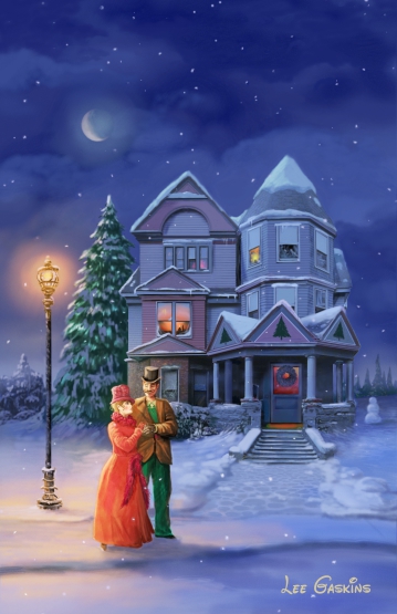
2007, I returned to more of an intimate setting for 'the couple,' with a bit of a Currier and Ives feel, earlier-influences purple sky look. Now the gentleman has a present. What could it be? At first, the images were myself and my wife, but that version was destroyed (or lost). So one year, I decided to go more diverse in ethnicity (as now, people are obsessed with skin color (pathetically sad)). Not my favorite piece, but my least either. The snowman's face could be more interesting.
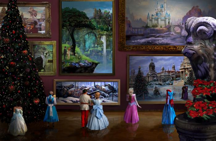
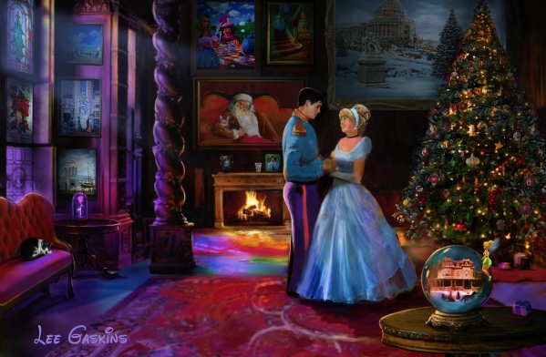
2017 brought different year, with a different card. I wanted an interior, but didn't want to have the subject matter in a home. So I thought, what the hell- a museum. None of my work will ever go in a m museum, so why not paint it? Lol. Besides, if you look at the large painting about Cinderella and Prince Charming, that was supposed to be the X-mas card (or course a snowy version), but I changed my mind. The smaller painting underneath, as a winterized version of my Dad’s painting called’ ‘In His Hands,’ which I gave to my Mom, then was given to my Nephew- CP. It was very difficult to find `back of princess’ reference, but the image came out alright.
Along the this time, I really began being impressed by the architecture at the 1904 World's Fair. This 2006 card kept 'the couple' theme, while setting in a snowy backdrop of the largest Victorian World's Fair ever seen. I made sure the snow did not hamper the view of the Palace of Machinery. The trees were all made-up, because I wanted it to have more of a holiday feel. Initially, the image was a summer scene, which I winterized.
2000's card. Long a go, my Dad (who I miss a lot), drew cartoons of the family as X-mas cards. It literally was a timeline of how we all grew up, and what the family was doing. We were a family back then. Fond memories. So, after art school, I decided to continue this tradition, but it started with a dinosaur- I called- Santasaurus. They were all hand-drawn and painted. They I did black and white pen cards, until I stated to get more proficient with Corel Painter. I paint on the computer the same, as traditional paint… but in this case, I try to add something from prior years into the new card. This image, which was my millennial holiday card, was inspired by Victorian romanticism. I was going to have this theme with the same characters every year, but chose later not to. The part I don't like? Obviously a creepy Santa in the frame. He looks a bit serial-killer-ish- lol.
2002's card. The theme of the couple continued. The image's composition became a bit more sophisticated (who puts a x-mas tree in a gazebo? lol). Same issue with the snow, but as you can see the couple was a bit more lovey-dovey. The gazebo was a tough object to do, especially the under-roof structure. I added snowmen (the foreground none being too small), and trees to help flesh out the design, The sky was entirely impossible, but again, art does not have to be 100% real....
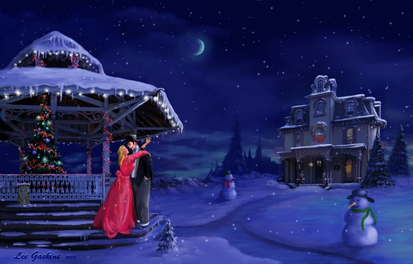
After seeing 'Meet Me in St. Louis,' one of the most saccharine movies ever made (but still wonderful), I began to really appreciate the Victorian era, as well as homes. I created this backstory of 'the couple.' And supposedly, year by year, people would see their progression, through my holiday cards. I began this theme, but found it too restricting. But I do like the mood in this picture- simpler times. I do like top hats on both male and females. One issue was the snowflakes blending into the stars... wish there was more contrast between the two.
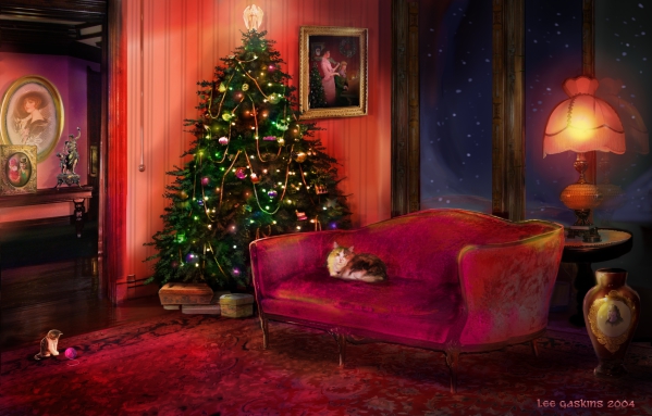
2004's card returned to the 2000 theme of and similar house where the two Victorian ladies lived. This time, it housed 'Ginger,' our calico cat/terror... and a generic kitten,. I added the 2000 card to tie the concept together. Nevertheless, the rug was very difficult to do.
This 2005, kept the Victorian homey feel going. Ginger was still alive at the time. I wanted to 'glow-up' the light without going too moody. As my Mom was still with me (during this card's creation time), I added a small image of my Dad (under the rosy flowers), and Jose, or last Siamese cat (left of the tree top). With the additional element of the stirs, this image was much more difficult to do than planned. I like the composition of this image better than most X-mas pictures I have done. BTW, the 2004 card is below Jose's portrait.
This 2005, kept the Victorian homey feel going. Ginger was still alive at the time. I wanted to 'glow-up' the light without going too moody. As my Mom was still with me (during this card's creation time), I added a small image of my Dad (under the rosy flowers), and Jose, or last Siamese cat (left of the tree top). With the additional element of the stirs, this image was much more difficult to do than planned. I like the composition of this image better than most X-mas pictures I have done. BTW, the 2004 card is below Jose's portrait.
This 2005, kept the Victorian homey feel going. Ginger was still alive at the time. I wanted to 'glow-up' the light without going too moody. As my Mom was still with me (during this card's creation time), I added a small image of my Dad (under the rosy flowers), and Jose, or last Siamese cat (left of the tree top). With the additional element of the stirs, this image was much more difficult to do than planned. I like the composition of this image better than most X-mas pictures I have done. BTW, the 2004 card is below Jose's portrait.
Another card of 'the couple,' This was the 2008 holiday card, and for the second straight year, I continued the 1904 World's Fair exterior location. This time, I concentrated on the Festival Hall (it was larger than the Vatican and of course the statue of Thomas Jefferson. I think I like the large x-mas tree the most. I muted the color palette slightly for this piece. The snow in particular, was fun to paint.
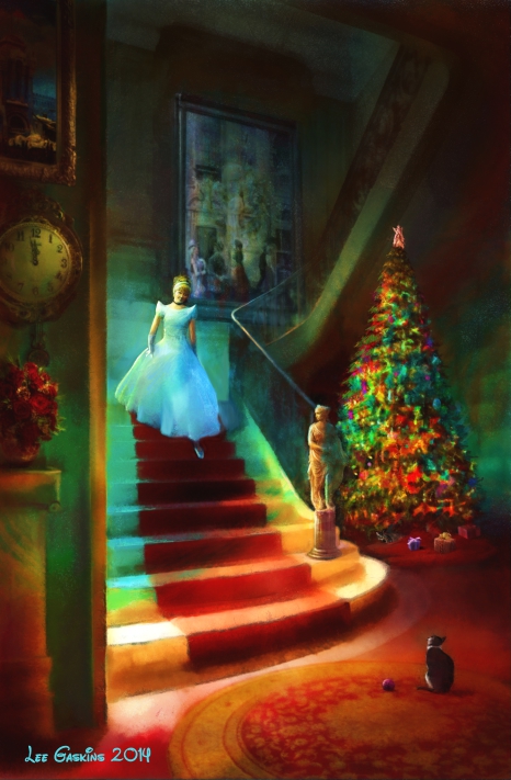
2014. my concept went to Disney. I love Walt Disney World, and all the artistry (not crazy about the money-grubbing company). But the stories, the artwork, the engineering, simply amazing... when I go there, I feel just like a kid. So I painted Cinderella descending the staircase with my cat Lily waiting for she wanting to play. This seems to have a more `classic' feel. The stairs were super-tough to do. I liked adding more color and saturation to the works.
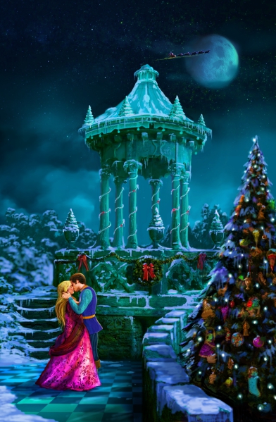
2015's card was a sequel to the previous. I wanted to go more romantic. I added Santa in the distance to help add some overlapping to the sky. The piece suggests Disney Princess and Prince without being specific, although I was thinking Sleeping Beauty. Their clothes are more colorful to stand out again the snowy backdrop. The checkered floor wasn't necessary, but I wanted to push myself.
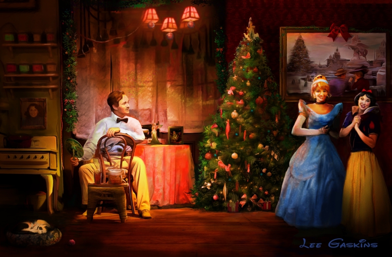
Although I finished the majority of this piece before my wife's Mom passed away, I added a picture of her as an homage. This 2019 card is not my favorite, but it is sweet, combining Disney with two 1904 World's Fair elements. Cinderella's dress was awful to paint... but I did enjoy the lighting. Might return to Belle for new year. But maybe with a twist.
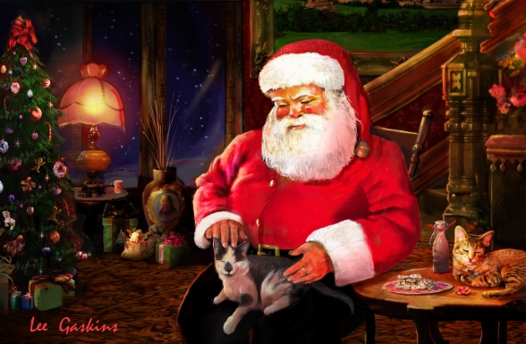
2013's card idea came from the old Coke ads. I was okay with how Santa came out but never liked this image at all. Should have started over but my wife thought it was fine. Might return to this concept with a better design someday.
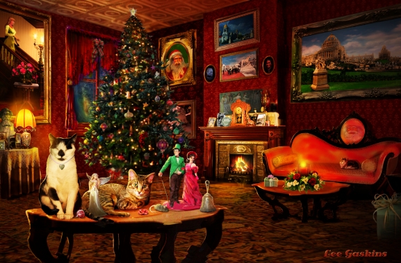
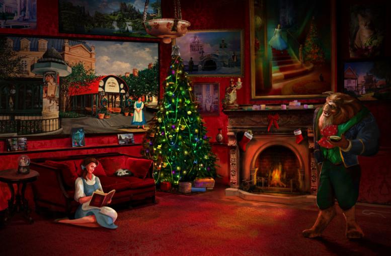
Tabby's sudden death at a too-early age had us devastated. I continued the Disney theme for holiday cards in 2018 by adding Belle and the Beast at their `home.' At the far right is a painting of Tabby, with Lily snuggling on the sofa, I wanted the palette and mood to be warm, as if Belle is reflecting on Tabby's life. The Cinderella painting above the fireplace was 2014's card.
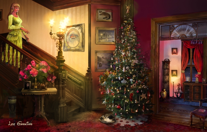
2016, returned to Cinderella. This year was a difficult one, so I made the card a tad more simple. Again, Lily is curled up on the sofa... but I tried to add more 1904 World's Fair elements, as well as Disney. Notice the Beast's rose in the glass? I did a semi-hidden Mickey carpet. The snow globe was fun to create, as well as the tree-stained glass. Nice to add Tinkerbell as well. Not my favorite holiday card... kinds (to me), middle of the road.