I don't usually post unfinished work, but what the hell. lol This was going to be Warpath's follow-up album cover.. Any though it is roughly 90% done, I added this to show some contrast from other covers. Unfortunately Rich gave me the news that Warpath would be no more, and I didn't have to finish it. Yes, it was a waste of my time for no money... but what can you do? This was fun... more in-line with traditional metal covers, but with more bite. lol
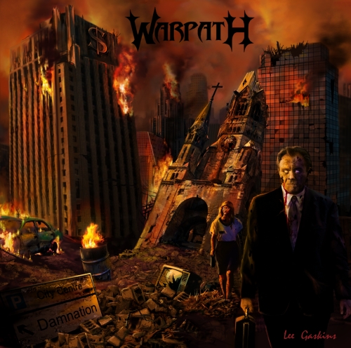
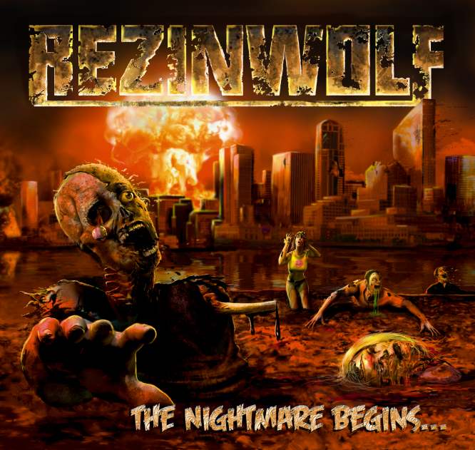
A very talented metal musician: Rich Goss, from a band called Warpath, called me up to do a cover. The nice thing about Rich was his open-mindedness. He didn't want the same crap that was on most of metal/dead metal bands. He wanted something different. I drew up about 5 ideas, and he chose the above. A bit more realistic than I prefer, but I added a lot of warm tones to give in a mood. Rich didn't want cartoonish or cliched zombies, he liked the idea of businessmen, real people... which gives it a unique feel. Getting the lines straight on the buildings was a huge pain! Warpath was voted the best unsigned band in the world at one point in time. But things did change. Mr. Goss, got into acting, and now is a fairly known actor in movies and TV shows! Bravo! Rich! Lots of kids from school asked me to autograph this cover. lol
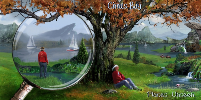
Multi-talented musician- Bill Gilliam, emailed me asking to do a Cirrus Bay cover. I did know the melodic Prog band, and was puzzled that he would switch artists (as I really liked the prior cover). Anyway, he was a fan of Willowglass, and he wanted something in the style of my first WG cover for them. Bill wanted a blind person, sitting against a tree, with other elements such as the two boats, horseback riders, and magnifying glass. After sketch approval, I painted the work. I was a bit worried that the figure in the magnifying glass might look too much like a young Fish from Marillion, but Bill was fine with it. Compositionally, I used the tree to frame the background... as well as overlapping the glass, Very enjoyable job and he is fantastic working with. Thanks Bill!
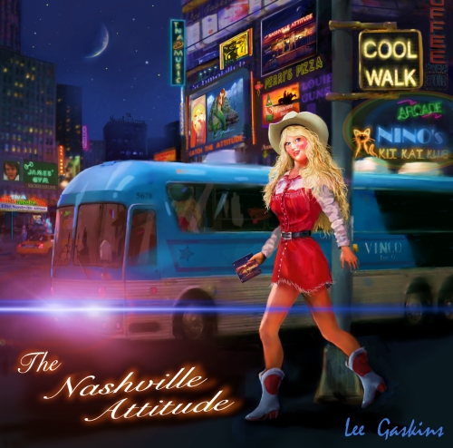
The Nashville Attitude is headed by a talented multi-instrumentalist- Marc Vincent Sica. After the first album cover I did for him, Marc wanted a country girl in the city. Entitled 'Cool Walk.' I used a traffic walking sign to name the album. Lot's of in-jokes in the building signs. Although I am not a huge fan of country music, these guys are very good, and especially versatile. Marc can play blues, Jazz and Rock! And like rap, country bands rarely use artwork for a cover. Thanks Marc!
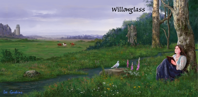
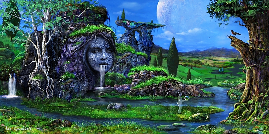
Years back, Multi-talented Andrew Marshall asked me to a cover for a band he wanted to create. Looking back, he struggled with a cool band name, that reflected his musicality. I suggested Willowglass, and he liked it. Anyway, he wanted a girl sitting against a tree. Now you might have heard this idea in my prior pieces before, but this is the first one. And since I like Pre-Raphaelite subject matter, I thought it might make the image feel timeless, and... right. It's amazing how many symphonic Prog bands gravitate towards this cover. I think it's okay. Simple, sweet and romanic in a girl-dreamy- sort of way. The music is all instrumental and has a bit of a Genesis/Hatfield influence. Andrew was a delight to work with. Incidentally the back cover blends in with the left side of the flap, making it a 3:1 ratio long piece (not shown).
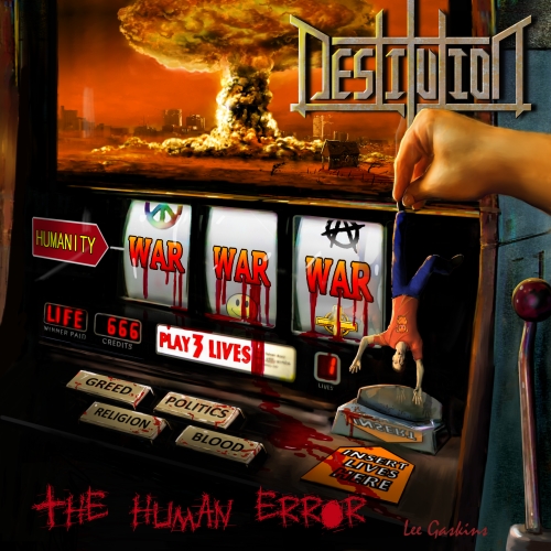
This was one of the most difficult covers to do, because of the buttons, and the perspective. Another death metal band asked me to do a cover. The nice thing about this concept is that it is unique, you don't see metal covers looking like this, again like rap covers, metal bands tend to play it extremely safe and wuss out... skulls, explosions, zombies... Boring! Give kudos to the band for at least one album, going in a creative direction (they went back to the same old the next album- albeit an adequate cover). With the exception of the idea, this cover was not fun to do, although the band was very cool!
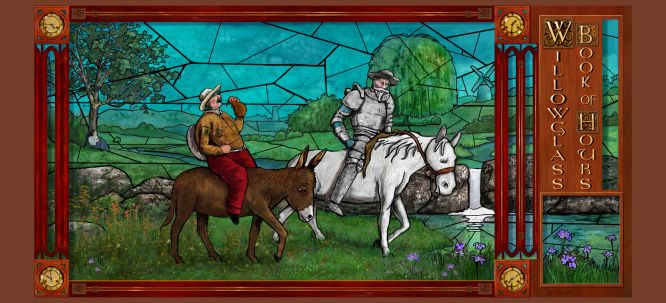
After the success of his debut album, Andrew asked me to do follow up art, entitled Book of Hours. I wanted to go different. Andrew wanted Don Quixote as the focal point of the front cover. I suggest a quasi-stained glass feel, and he agreed. T=Notice the stained glass is more prevalent on the top and fades as it goes downward. This was intentional. Andrew later created a limited vinyl record and sent me one. Very cool! Incidentally, the art work was voted in DPRP as one of the top album covers of the year. I didn't expect that, given that Andrew, and I are not household names. Check out his music, it is phenomenal.
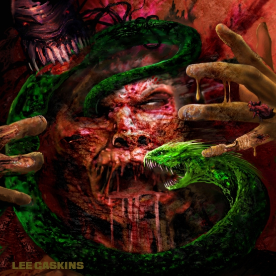
A fun, yet same-as-what-we-have-seen-before album cover by a cool death metal band. The zombie stretching out was fun to do. I probably added too many elements to it (should have nixed the severed head), but they wanted it. The band was very nice.
Ah... the trials and tribulations of an American artist working for foreign countries. This is an Italian album cover by a Prog-metal band called- Loreweaver. A very talented keyboardist (and violinist), who could write some some English asked me to do the cover. We agreed on concept and price. I will not mention her name, as she was nice. After finishing the artwork, which accepted, she broke up with one of the band members, and fell off the face of the Earth. I contacted the band, because they never paid me. People don't bloody care except for themselves! Anyway, the above image was changed a bit because I wanted to post it without their name, but I don't care anymore,. I believe they broke up. Good riddance!. Thanks for wasting my time- Loreweaver!
This cover is an oldie but a goodie to me, the band may or may not be dead, is/was lead by a very passionate, and talented musician. I used my niece-in-law to pose for the girl. The client wanted a ship... and I gave it a bit quaai-romantic feel to it. The building is an homage to the Festival Hall at the 1904 World's Fair. The piece was a favor to the client, in hope that it would grow into more work, but then it escaladed got into all sorts of crap with the guitarist stiffing me on his solo album & wasting well over a hundred hours of my time. Then, the band leader (without permission), modified my artwork, cropping it releasing an EP version, and not even sending me a disc! Guess he doesn't understand anything about individual reproduction rights. And then, he begged for a friend who had a torturous break-up (like we all never had that), for another free art cover. Again, more of this me, me, me, attitude. But again, it was partially my fault for saying yes all the time, and believing other people's words. Currently I am trying to eliminate the negatives in my life, and am very wary about doing artwork overseas anymore. And to be candid, I don't need to. Regardless, the piece was fun to paint, and compose. The boat came out the best. I also designed the logo- which is okay.
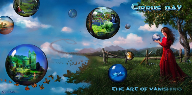
Back to the positive. Another Cirrus Bay cover. The concept sketches, and rendering came along fast. Bill knows exactly what he wants but is also flexible. I would have like to hear some of the tracks as I was working on this, but the client said they fit perfectly. I added the prior album cover into the flap. Because the album has an environmental message, I added bubbles the contain endangered or extinct animals: like the Southern White Rhino, The Blue-fin Tuna, Tiger, etc. Other globes have snippets of other pieces, as well as an oasis with a heart-shaped sun. I suggested the idea of the landscape crumbling into butterflies, and Bill liked the idea. What a nice person, and a talented musician. It was a pleasure Mr. Gilliam.
These are only a handful of all the covers I have done. To see more, you need to look round the Internet and discover. Cheers!